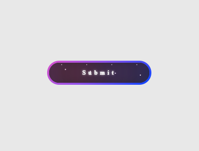
This is an attractive submit button featuring an animated starry background and a soft glowing effect. The colorful gradient and smooth hover animations enhance the user experience and make the button visually appealing.
					<!DOCTYPE html>
<html lang="en">
<head>
  <meta charset="UTF-8" />
  <meta name="viewport" content="width=device-width, initial-scale=1" />
  <title>Glowing Star Button</title>
  <style>
    /* Button styles */
    .btn {
      display: flex;
      justify-content: center;
      align-items: center;
      width: 13rem;
      overflow: hidden;
      height: 3rem;
      background-size: 300% 300%;
      cursor: pointer;
      backdrop-filter: blur(1rem);
      border-radius: 5rem;
      transition: 0.5s;
      animation: gradient_301 5s ease infinite;
      border: double 4px transparent;
      background-image: linear-gradient(#212121, #212121),
        linear-gradient(
          137.48deg,
          #ffdb3b 10%,
          #fe53bb 45%,
          #8f51ea 67%,
          #0044ff 87%
        );
      background-origin: border-box;
      background-clip: content-box, border-box;
      position: relative; /* needed for absolute children */
    }

    /* Container for stars */
    #container-stars {
      position: absolute;
      z-index: -1;
      width: 100%;
      height: 100%;
      overflow: hidden;
      transition: 0.5s;
      backdrop-filter: blur(1rem);
      border-radius: 5rem;
    }

    /* Text style */
    strong {
      z-index: 2;
      font-family: "Avalors Personal Use";
      font-size: 12px;
      letter-spacing: 5px;
      color: #ffffff;
      text-shadow: 0 0 4px white;
    }

    /* Glow effect wrapper */
    #glow {
      position: absolute;
      display: flex;
      width: 12rem;
    }

    /* Glow circles */
    .circle {
      width: 100%;
      height: 30px;
      filter: blur(2rem);
      animation: pulse_3011 4s infinite;
      z-index: -1;
    }

    .circle:nth-of-type(1) {
      background: rgba(254, 83, 186, 0.636);
    }

    .circle:nth-of-type(2) {
      background: rgba(142, 81, 234, 0.704);
    }

    /* Hover states */
    .btn:hover #container-stars {
      z-index: 1;
      background-color: #212121;
    }

    .btn:hover {
      transform: scale(1.1);
    }

    /* Active states */
    .btn:active {
      border: double 4px #fe53bb;
      background-origin: border-box;
      background-clip: content-box, border-box;
      animation: none;
    }

    .btn:active .circle {
      background: #fe53bb;
    }

    /* Stars container */
    #stars {
      position: relative;
      background: transparent;
      width: 200rem;
      height: 200rem;
    }

    #stars::after {
      content: "";
      position: absolute;
      top: -10rem;
      left: -100rem;
      width: 100%;
      height: 100%;
      animation: animStarRotate 90s linear infinite;
      background-image: radial-gradient(#ffffff 1px, transparent 1%);
      background-size: 50px 50px;
    }

    #stars::before {
      content: "";
      position: absolute;
      top: 0;
      left: -50%;
      width: 170%;
      height: 500%;
      animation: animStar 60s linear infinite;
      background-image: radial-gradient(#ffffff 1px, transparent 1%);
      background-size: 50px 50px;
      opacity: 0.5;
    }

    /* Animations */
    @keyframes animStar {
      from {
        transform: translateY(0);
      }
      to {
        transform: translateY(-135rem);
      }
    }

    @keyframes animStarRotate {
      from {
        transform: rotate(360deg);
      }
      to {
        transform: rotate(0);
      }
    }

    @keyframes gradient_301 {
      0% {
        background-position: 0% 50%;
      }
      50% {
        background-position: 100% 50%;
      }
      100% {
        background-position: 0% 50%;
      }
    }

    @keyframes pulse_3011 {
      0% {
        transform: scale(0.75);
        box-shadow: 0 0 0 0 rgba(0, 0, 0, 0.7);
      }
      70% {
        transform: scale(1);
        box-shadow: 0 0 0 10px rgba(0, 0, 0, 0);
      }
      100% {
        transform: scale(0.75);
        box-shadow: 0 0 0 0 rgba(0, 0, 0, 0);
      }
    }
  </style>
</head>
<body>
  <!-- Glowing star button -->
  <button type="button" class="btn">
    <strong>Submit</strong>
    <div id="container-stars">
      <div id="stars"></div>
    </div>
    <div id="glow">
      <div class="circle"></div>
      <div class="circle"></div>
    </div>
  </button>
</body>
</html>